The Hidden Cost of Spreadsheet Analytics in Insurance
Every carrier, MGA, and MGU we talk to runs their analytics on spreadsheets. Here's what that actually costs you — and it's not just the analyst's time.
Let's start with an honest observation: spreadsheets work. They're flexible, everyone knows how to use them, and they don't require a budget approval to set up. For a 50-person MGA or a regional carrier with a small actuarial team, Excel has been the analytics platform for decades. We're not here to tell you spreadsheets are bad. We're here to help you understand what they're quietly costing you.
The Two-Week Reporting Cycle
The most visible cost is time. At nearly every commercial insurance organization we've worked with, the quarterly board report follows the same pattern: someone pulls data from the policy admin system, someone else pulls from the claims system, a third person reconciles the two in a series of linked spreadsheets, and then the VP of Underwriting or the CFO spends two to three days formatting it into a presentation. The whole cycle takes 10 to 14 business days.
That means your board is making decisions based on data that's already 6 to 8 weeks old by the time they see it. In a market where rate adequacy can shift in a single quarter, that lag isn't just inconvenient — it's a competitive disadvantage.
But the time cost isn't the real problem. The real problem is that the people building those reports are the same people who should be analyzing the data. Your senior analyst isn't analyzing loss trends — she's formatting pivot tables. Your actuary isn't modeling rate adequacy — he's debugging a VLOOKUP that broke when someone added a column.
The Errors Nobody Catches
A 2023 study by the European Spreadsheet Risks Interest Group found that 88% of spreadsheets with more than 150 rows contain at least one error. In insurance analytics, where a single mislinked cell can misstate a loss ratio by 10 points or miscount bound policies by hundreds, those errors have real consequences.
We've seen it firsthand. A mid-size carrier believed their Workers Comp line was running at a 58% loss ratio based on their internal spreadsheet. When we loaded the same data into a structured analytics platform, the actual number was 71%. The discrepancy? A filter in the spreadsheet was excluding claims that were reopened after initial closure. Nobody noticed because the spreadsheet didn't flag the exclusion — it just silently dropped 340 claims from the calculation.
That's a 13-point error on the metric that drives pricing, reserving, and reinsurance decisions. And the carrier had been operating on the wrong number for over a year.
The Questions You Can't Ask
The subtlest cost of spreadsheet analytics is the questions that never get asked. When every answer requires a new tab, a new data pull, and a few hours of manipulation, people stop asking questions. They stick to the standard reports because those are the ones that are already built.
“Which producers have a declining hit ratio this quarter compared to last?” That's a 30-second question in an analytics platform with comparison built in. In a spreadsheet environment, it's a half-day project.
“What's our average cycle time from clearance to first quote, broken down by underwriter and LOB?” With the right dashboard, that's two clicks. In Excel, it's a multi-tab pivot with a SUMPRODUCT formula that one person in the company understands.
“Show me every submission that's been sitting in clearance for more than 5 business days right now.” In a pipeline dashboard, that's a filter. In a spreadsheet, it's a report that doesn't exist yet.
The cost here isn't the analyst's time. It's the decisions that don't get made because the questions don't get asked. It's the underperforming LOB that runs for another two quarters because nobody had the bandwidth to investigate. It's the producer with a 9% hit ratio who keeps getting co-op marketing dollars because the only report anyone sees is premium volume.
The Tribal Knowledge Problem
In every spreadsheet-driven organization, there's one person — sometimes two — who understands how the reports work. They know which tab feeds which chart, which columns to hide before presenting to the board, and which formula has a hardcoded exception for “that one policy that got booked wrong in 2019.”
When that person goes on vacation, reporting stops. When they leave the company, the institutional knowledge walks out the door. We've seen organizations spend months trying to reverse-engineer a departed analyst's spreadsheet — only to discover it had been wrong the entire time.
This isn't a technology problem. It's a business continuity risk disguised as an analytics workflow.
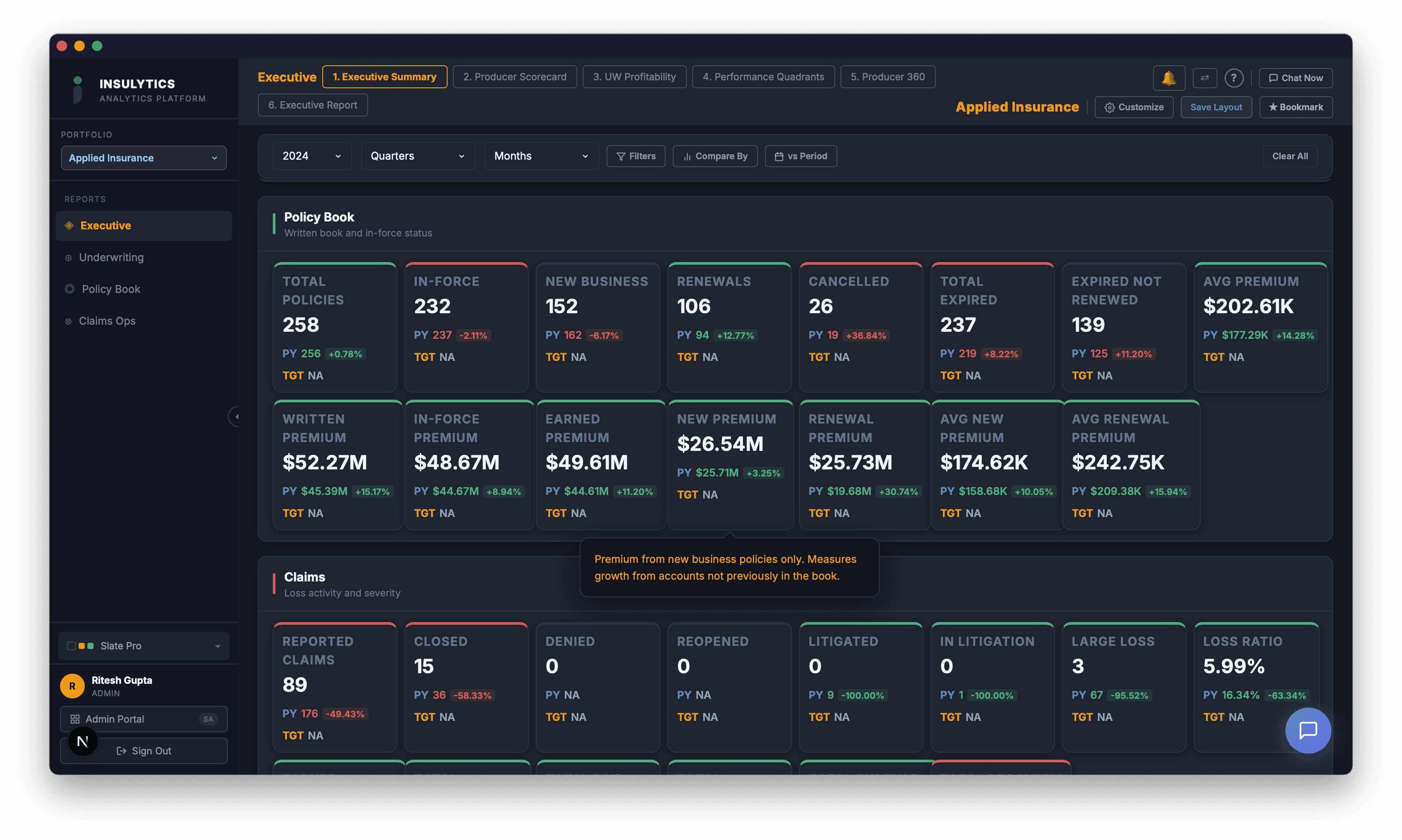
What the Transition Actually Looks Like
Moving from spreadsheets to a structured analytics platform doesn't mean throwing everything away overnight. The practical path looks like this:
- Start with the data you already have.You're already exporting CSVs and Excel files from your policy admin and claims systems. That's the same data that feeds an analytics platform — it just goes into a structured pipeline instead of a spreadsheet.
- Replace the highest-pain report first.For most organizations, that's the quarterly board report or the monthly submission pipeline summary. When the report that takes 2 weeks now takes 2 minutes, the value is immediately visible to leadership.
- Let the spreadsheets die naturally.You don't need to mandate a switch. Once people have access to dashboards that answer their questions in real time, they stop opening the spreadsheet on their own. We've seen it happen at every organization we've worked with — the analyst who built the original spreadsheet is usually the first one to abandon it.
The Math
If your analytics team spends 40% of their time building and maintaining spreadsheet reports — and that's a conservative estimate based on what we've measured across our client base — then for a two-person team earning $85K each, you're spending $68,000 per year on report assembly. Not analysis. Not insight. Assembly.
Add the cost of the errors you're not catching, the questions you're not asking, and the decisions you're making on stale data, and the true cost of spreadsheet analytics is a multiple of what most executives assume.
The spreadsheet got you here. It served its purpose well. But the question for insurance leaders in 2026 isn't whether spreadsheet analytics work — it's whether you can afford what they're costing you.